
A good website must be able to offer value, convert and retain visitors. If your website is poorly designed, you risk losing visitors and potential customers. Here are some qualities of a good website:
Easy to navigate and use (UI & UX)
A good website must be easy to use and find things. People leave if they can’t find what they were looking for.
Remove unnecessary clutter from your website, like annoying popups and excess banners. These things can confuse people making them bounce.
Make sure your navigation and links are clear and simple so that people find what they want quickly.
Here is a checklist of things to improve:
- Use vivid fonts that are easy to read. Also, make your fonts big enough (
16px – 18px) - Increase your line height so that sentences are easy to read without strain. 1.5 -1.8 line height is good
- Make your navigation bar and links clear
- Use contrasting colours that are easy on the eye.
- Avoid excessive banners and popups
- Avoid outrageous effects and animations that hinder navigation.
- Provide clear call-to-action buttons
Helpful content for users
Provide quality and helpful content on your website. Explain your services and products in detail.
Avoid thin pages with little value for the user.
Create a blog section that offers helpful content and insights.
Good quality content can make your website rank high in searches.
Mobile Responsive
In today’s mobile-first world, mobile responsiveness is no longer optional — it’s essential. With over 60% of web traffic coming from smartphones and tablets, your website must adapt seamlessly across all screen sizes.
A mobile-responsive website automatically adjusts its layout, content, and images to fit the screen it’s being viewed on — whether it’s a desktop, tablet, or mobile phone. This ensures users get an optimal experience regardless of their device.
Benefits of Mobile Responsiveness
- Improved User Experience: Mobile users can easily navigate, read content, and interact with your site without zooming or horizontal scrolling.
- Higher Search Rankings: Google prioritises mobile-friendly websites in search results, especially with mobile-first indexing.
- Faster Load Times: Responsive design often includes optimised assets for mobile, improving performance and reducing bounce rates.
- Increased Engagement & Conversions: A mobile-friendly site keeps visitors engaged and makes it easier for them to take action, such as filling out a form or making a purchase.
Fast Loading
Website speed is critical in retaining visitors on your website. People bounce if your website takes a long time to load.
Speed is also crucial for ranking in searches. Google and other search engines prioritise websites that load fast.
Here’s how you can improve website speed:
- Remove unnecessary scripts and styles
- Minify or compress files
- Compress images or convert modern image formats that are small in siz, e.g. webp and avif
- Use CDNs to deliver static resources like images.
- Cache static resources for a long time
SSL certificate for security

Ensure your website is secured with an SSL Certificate. SSL stands for Secure Sockets Layer, and prevents data sent from and to the website from being intercepted by hackers.
The little padlock you see to the top left of browsers signal a secure website.
SSL certificates are crucial if you process sensitive data such as user accounts and bank details.
Most web hosts come with free SSL certificates.
Conclusion
Good websites must offer helpful content and drive traffic and conversions.
FAQs
What is mobile responsive
Mobile responsive refers to a website design that automatically adjusts and displays correctly on different screen sizes—such as smartphones, tablets, and desktops. It ensures that users have a smooth, easy-to-navigate experience no matter what device they’re using. Text, images, buttons, and layouts resize or rearrange to fit smaller screens without needing to zoom or scroll sideways.
What is UI (User Interface)
UI, or User Interface, refers to the visual elements and layout of a website or app that users interact with—such as buttons, menus, icons, and screens. It focuses on the look, feel, and presentation to ensure that the interface is clear, consistent, and visually appealing. Good UI makes it easy for users to understand and interact with a digital product.
What is UX (User Experience)
User Experience (UX) is how a person feels when interacting with a website, app, or digital product. It includes ease of navigation, design clarity, loading speed, and how well the site helps users achieve their goals. A good UX makes a site intuitive, enjoyable, and efficient to use.
Further reading
This page was written with the assistance of AI. Read more about our AI usage policy
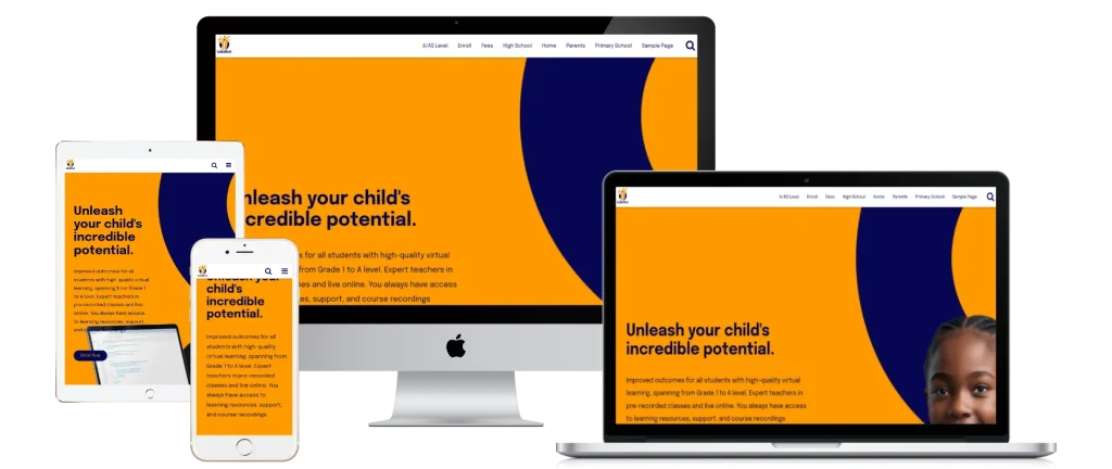
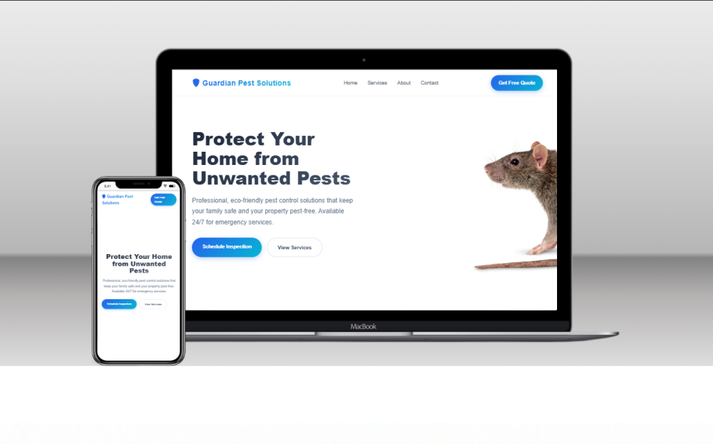
Check Out Websites We Have Created
We create quality websites that drive traffic and conversions
Need a Website Designed?
Our web development team specialises in building fast, mobile-friendly websites that rank well and convert better.