
Since the rise of mobile devices, there has been a need to ensure that websites display and function properly across different devices.
This article will guide you on everything about mobile responsive or mobile-friendly websites, what they are and why they’re important.
What Is Mobile Responsiveness?
Mobile responsiveness is a design approach that ensures your website automatically adjusts and looks good on all screen sizes — from large desktop monitors to tablets and small smartphone screens.

A mobile responsive website:
- Automatically resizes images and text
- Reorganises page layout for smaller screens
- Ensures buttons, forms, and menus are easy to use on touchscreens
- Maintains functionality and fast loading across all devices
- No horizontal scrolling, or zooming and pinching on mobile to view parts of a page

Mobile responsive stats
Here are some stats just to show the importance of mobile-friendly websites:
- Over 60% of global website traffic comes from mobile devices (Statista – Mobile Internet Traffic) Worldwide
- 53% of mobile users abandon sites that take longer than 3 seconds to load (Mobile site load time statistics – Think with Google )
- 88% of consumers are less likely to return to a site after a bad mobile experience according to Google Mobile UX Research
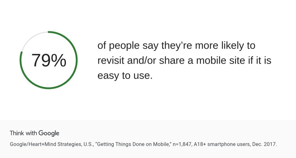
- 79% of people say they’re more likely to revisit and/or share a mobile site if it is easy to use(Mobile stats – Think with Google)
- Mobile-friendly websites are more likely to rank higher in Google search results (Google Search Central – Mobile-Friendly Update)
- More than 50% of smartphone users discovered a new company or product through mobile search,
Why Mobile Responsiveness Is Important
Mobile-First Indexing by Google
In 2019, Google officially rolled out mobile-first indexing, meaning Google primarily uses the mobile version of a site for indexing and ranking. If your mobile site is poorly optimized, your overall SEO performance can suffer — even if the desktop version looks great.
Better User Experience
User behaviour is central to success online. A mobile-responsive site:
- Eliminates the need for pinching or zooming
- Ensures readable fonts and well-spaced buttons
- Loads quickly and navigates easily
This leads to longer session durations, more engagement, and lower bounce rates.
Increased Conversions and Sales
A smooth website experience drives conversions and sales. It shouldn’t be a hassle to read an article, fill out a form, buy something, or book an appointment.
Faster Page Load Times
In these modern times, people don’t have time to wait for a long website load; they bounce off immediately if a website takes too long to display.
Responsive design encourages the use of optimised media and CSS, resulting in faster loading speeds. Since page speed is a confirmed ranking factor, improving mobile performance can enhance both SEO and user retention.
Cost and Maintenance Efficiency
Rather than maintaining two separate websites (desktop and mobile), a responsive website is easier to manage, update, and scale — saving both time and development costs.
SEO Boost
Google mobile-first indexing prioritises mobile devices over other devices, giving mobile-responsive websites a boost in rankings.
Dwell time is also crucial.
If users bounce often from a website, it can signal search engines that the website is not valuable or is not offering a good user experience, potentially dropping in rankings.
Key Features of a Mobile Responsive Website
Here’s what to look for in a mobile-optimised site:
- Flexible Grids and Layouts
- Responsive Images and Media
- Fast Loading Times
- Mobile-Optimized Forms
- Readability Without Zoom
- No Horizontal Scrolling
How to Make Your Website Mobile Responsive
Use a Responsive Design Framework
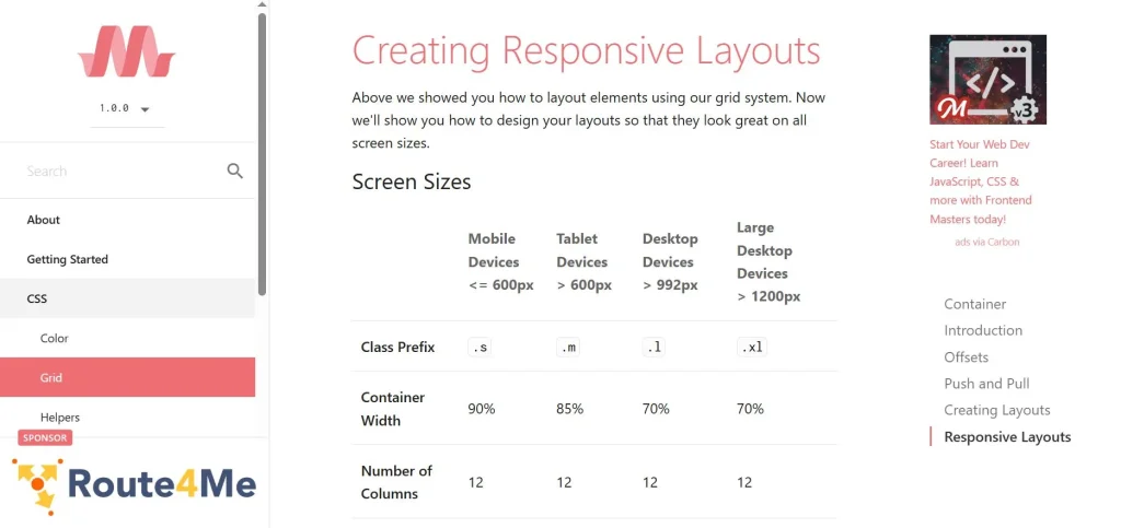
Frameworks like Bootstrap, Tailwind CSS, or Materialize offer pre-built responsive components and grid systems to help you design mobile-first layouts.
Hiding Elements

Some elements are meant for desktop and not necessary to show on mobile devices, and can therefore be hidden. This can be achieved using CSS media queries to show some elements on desktop and hide them on smartphones.
Optimize Images and Media

Use responsive image tags (<picture> or srcset) and compress images with tools like Image Converter or convert to small image formats such as WebP and Avif format to maintain fast loading on mobile.
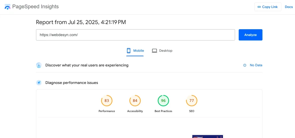
Prioritize Mobile Page Speed
Use tools like Google PageSpeed Insights to test load times and implement recommendations like:
- Minifying CSS, JavaScript, and HTML
- Enabling lazy loading on images
- Reducing server response time
Here are some page speed and performance stats for one of our websites called Web Desyn:
Implement Mobile-Friendly Navigation
Use hamburger menus, sticky headers, or dropdowns that are intuitive on small screens. Avoid large multi-level menus that clutter the interface.
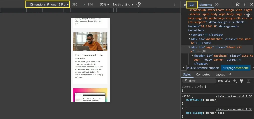
Test Across Devices
Regularly test your website on different screen sizes and browsers. Use:
Google Chrome DevTools (Responsive Mode): Right-click on any web page. Scroll to Inspect. Click the icon with some devices. Choose the mobile phone in the left you want to test with.
- BrowserStack for cross-device testing
You can also simply open a web page on mobile; if it has horizontal scrollbars and requires zooming and pinching to view parts of the website, then it is not mobile-friendly.
Common Mistakes to Avoid
Avoid these pitfalls when optimising your site for mobile:
- Using Flash (not supported on most mobile devices)
- Small font sizes and hard-to-tap buttons.
- Non-contrasting text colours.
- Overloaded pages with heavy scripts, styles, and effects.
- Fixed-width elements that break on small screens
- Pop-ups, banners or interstitials that block mobile content
Final Thoughts
Mobile responsiveness is the foundation of modern web design and a major contributor to your site’s SEO success, user satisfaction, and business growth. If your website isn’t optimised for mobile, you’re not just missing out on traffic — you’re losing trust and conversions.
Further Reading
Is Your Website Mobile-Ready?
If you’re unsure whether your site is mobile responsive, we can help. Our web development team specializes in building fast, mobile-friendly websites that rank well and convert better.
This page was written with the assistance of AI. Read more about our AI usage policy